Robot Invasion
This blog is for a game that I will be creating in Unity
Sunday, November 14, 2010
HUD while in the game
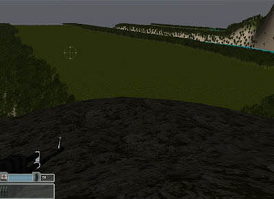
My HUD is in the bottom left corner becaouse it makes it easier to check you health and ammunition at the same time as well as see where your gun is aiming. The hud itself shows that you have 150 bullets in the ammo section as well as 3 rockets as your remaing ammuniton. I did this because it makes you have to try and avoid some enemies so that you will have enough ammo remainging to destroy the final enemy ship.
HUD
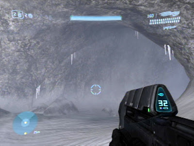 This HUD is from halo and features a HUD that shows a players Health, Grenades, Weapon and Reload clips and also a radar at the opposite corner. Overall this design is quite stylish in design but it is too detailed for something that I need to create.
Another HUD I found was from Call of Duty Modern Warfare 2.
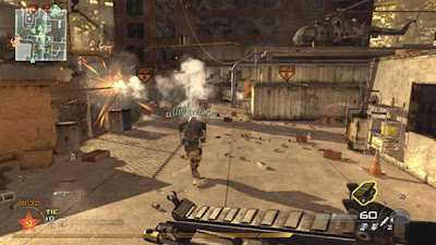 This HUD is different from the Halo HUD in that everything has been shifted around to the right so that the ammo count is in the bottom right corner instead of the top right and the radar is in the top left instead of the bottom left. While it is slightly more basic in design and closer to what I would use in the game I created, it has to many ideas inside of it that would have no affect on my game. It is missing a health bar which will be necessary in my game as well having unneeded affects such as the grenades and the game statistics.
The HUD that I have decided to go with will be this one.
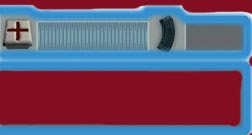
It is pretty basic in design. It has a health bar so that the person playing can have a way of losing by dying which gives the game a sense of reality. It has an ammo count to the right so that there isn't an infinite number of bullets and so that the player can keep track of it and finally at the bottom of the HUD is a bar where the rocket ammo is going to go into which will be the most powerful weapon the player will have access to. Compared to all of the other HUD's that I have showed this one has everything I need to show without going overboard in the details and also misses out on all the unnecessary data such as grenades.
Main Menu Document
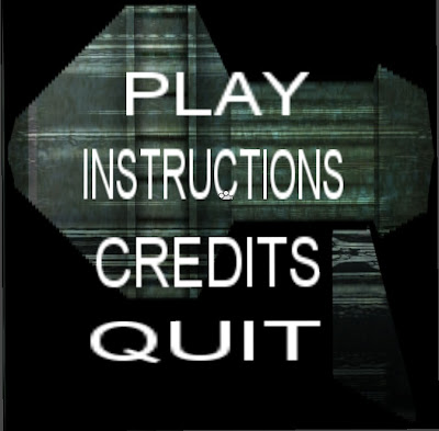
It has all the basic elements that a main menu needs. The design is pretty basic with all the funtions being one underneath the other. The background picture is a single handed rocket launcher that is used as my background because it is a cross concept between the two guns in the game that you can use.
Saturday, November 13, 2010
Player Interactions
1. Movement
In this game your character can move in any direction normally with a fair bit of speed as the level is fairly large. You will slide in this game to make it easier to get around enemy fire however you will be stopped if you run into a tree.
2. Jumping
This game allows you to jump as well in case there is an explosion nearby and you need to jump to avoid it as well as the fact that at the start and the end of the level there are mountains that you will need to jump up and down to get to where you need to go.
3. Shooting
This has been made easier with the use of a cross hair which I will have to give credit to my friend Alex Hopsick for. This means you will not waste nearly as many as you would otherwise and you will conserve them for when you need them the most.
To be able to use these easily I have decided that this game should be created for the pc as the controls are easiest to use when there is only one hand necessary at a time.
The controls on the keyboard are...
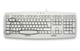
1 and 2 = Switch to your Machine Gun with 1 and your rocket launcher with 2.
w, a , s, d = Your movement, w is up, a is left, s is down and d is right.
q, e, z, c = Your viewing method, q is up left, e is up right, z is down left and c is down right.
ctrl = Another method to fire if it becomes necessary for one hand.
Space = This button is used to jump.
The mouse is only used if the user is able to use his other hand as well.
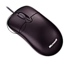 Left mouse click = Firing the currently equipped gun.
Whole mouse movement = Changing the camera angles.
These will be all of the controls available inside of my game until further notice.
Screenshots from unity
Imports from Max
1. A Bridge - this was later taken back out because it did not make sense inside of the level.
2. A Telescope - this was added to the end of the level so show that it was on top of a building and more suited towards being a lookout for the enemies.
3. A Parachute - this was so that the players know how they came to the island.
4. Sentry Tower - this was used as a lookout point for the robots.
5. Laser Gate - this is used to bar entry to the final area where the enemy base is.
6. Satellite Dish - used to detect where the enemy is coming from (owned by the enemy), mostly just a prop and has no effect in the game.
7. Hanging Rope - this is attached to the bottom of some of the sentry towers to show what happens to humans who invade. Mostly a prop with no affect in game.
8. Skeleton - a prop that was attached to the Hanging rope but was later taken out when it gave of an ugly appearance.
9. Abandoned boat - a prop that was made to show that humans were invading the island and swimming to shore using stealth maneouvers, they didn't make it so the boats stayed where they are.
10. Destroyed boats - this prop was for the original humans who tried invading with the boats all the way into the island. they were destroyed by the enemies rockets.


