Sunday, November 14, 2010
HUD while in the game
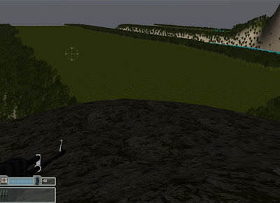
My HUD is in the bottom left corner becaouse it makes it easier to check you health and ammunition at the same time as well as see where your gun is aiming. The hud itself shows that you have 150 bullets in the ammo section as well as 3 rockets as your remaing ammuniton. I did this because it makes you have to try and avoid some enemies so that you will have enough ammo remainging to destroy the final enemy ship.
HUD
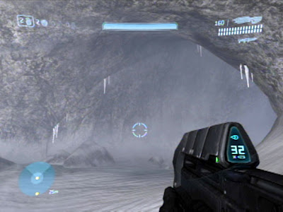 This HUD is from halo and features a HUD that shows a players Health, Grenades, Weapon and Reload clips and also a radar at the opposite corner. Overall this design is quite stylish in design but it is too detailed for something that I need to create.
Another HUD I found was from Call of Duty Modern Warfare 2.
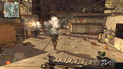 This HUD is different from the Halo HUD in that everything has been shifted around to the right so that the ammo count is in the bottom right corner instead of the top right and the radar is in the top left instead of the bottom left. While it is slightly more basic in design and closer to what I would use in the game I created, it has to many ideas inside of it that would have no affect on my game. It is missing a health bar which will be necessary in my game as well having unneeded affects such as the grenades and the game statistics.
The HUD that I have decided to go with will be this one.
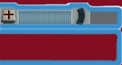
It is pretty basic in design. It has a health bar so that the person playing can have a way of losing by dying which gives the game a sense of reality. It has an ammo count to the right so that there isn't an infinite number of bullets and so that the player can keep track of it and finally at the bottom of the HUD is a bar where the rocket ammo is going to go into which will be the most powerful weapon the player will have access to. Compared to all of the other HUD's that I have showed this one has everything I need to show without going overboard in the details and also misses out on all the unnecessary data such as grenades.
Main Menu Document
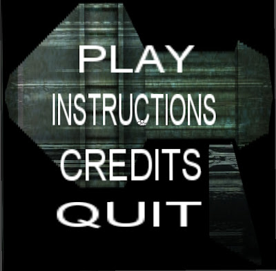
It has all the basic elements that a main menu needs. The design is pretty basic with all the funtions being one underneath the other. The background picture is a single handed rocket launcher that is used as my background because it is a cross concept between the two guns in the game that you can use.
Saturday, November 13, 2010
Player Interactions
1. Movement
In this game your character can move in any direction normally with a fair bit of speed as the level is fairly large. You will slide in this game to make it easier to get around enemy fire however you will be stopped if you run into a tree.
2. Jumping
This game allows you to jump as well in case there is an explosion nearby and you need to jump to avoid it as well as the fact that at the start and the end of the level there are mountains that you will need to jump up and down to get to where you need to go.
3. Shooting
This has been made easier with the use of a cross hair which I will have to give credit to my friend Alex Hopsick for. This means you will not waste nearly as many as you would otherwise and you will conserve them for when you need them the most.
To be able to use these easily I have decided that this game should be created for the pc as the controls are easiest to use when there is only one hand necessary at a time.
The controls on the keyboard are...
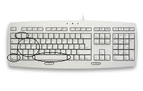
1 and 2 = Switch to your Machine Gun with 1 and your rocket launcher with 2.
w, a , s, d = Your movement, w is up, a is left, s is down and d is right.
q, e, z, c = Your viewing method, q is up left, e is up right, z is down left and c is down right.
ctrl = Another method to fire if it becomes necessary for one hand.
Space = This button is used to jump.
The mouse is only used if the user is able to use his other hand as well.
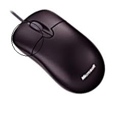 Left mouse click = Firing the currently equipped gun.
Whole mouse movement = Changing the camera angles.
These will be all of the controls available inside of my game until further notice.
Screenshots from unity
Imports from Max
1. A Bridge - this was later taken back out because it did not make sense inside of the level.
2. A Telescope - this was added to the end of the level so show that it was on top of a building and more suited towards being a lookout for the enemies.
3. A Parachute - this was so that the players know how they came to the island.
4. Sentry Tower - this was used as a lookout point for the robots.
5. Laser Gate - this is used to bar entry to the final area where the enemy base is.
6. Satellite Dish - used to detect where the enemy is coming from (owned by the enemy), mostly just a prop and has no effect in the game.
7. Hanging Rope - this is attached to the bottom of some of the sentry towers to show what happens to humans who invade. Mostly a prop with no affect in game.
8. Skeleton - a prop that was attached to the Hanging rope but was later taken out when it gave of an ugly appearance.
9. Abandoned boat - a prop that was made to show that humans were invading the island and swimming to shore using stealth maneouvers, they didn't make it so the boats stayed where they are.
10. Destroyed boats - this prop was for the original humans who tried invading with the boats all the way into the island. they were destroyed by the enemies rockets.
Assest List for sounds
Sound List
| Important | Medium | Not Very |
| Background Music | Water sound | Tree movement sound |
| Guns sound | Enemy dead sound | Enemy Movement sound |
| Movement sound | Plane beeping sound |
|
| Enemy fire sound |
|
|
Asset List for Models
Model List
| Important | Medium | Not Very |
| Trees | Hut | Grass |
| Sentry Towers | Rocks | Abandoned Ship |
| Robots | Satellite | Destroyed Ship |
| Plane | Parachute | Hanging Rope |
| Telescope |
|
|
Objectives
Main Objective.
1. Destroy the ship at the end of the level, be warned you will need enough ammo to destroy it. if not you will have game over.
Minor Objective.
1. You have minimum ammo so you will need to hold onto a lot of it and avoid most of the enemies that you will come across.
2. You can not swim as that would be cheating so doing this will make the game reset.
3. Your opponents weapons can kill their own allies so use this to your advantage.
Character Design
The first one is human and is going to be called Jim as it sound cool for an undercover operative.
He has short hair and an emotionless face at all times. He wears an outfit of complete black so that sneaking around is made easier. He will be the person you are in your game.
The second character is a robot who will be the main recurring enemy in the game. He is fully metal and is carrying a hand-held rocket launcher. His appearance is very bulky and has a helmet on so that you can't see underneath it.
The third character is actually a mobile facility disguised as a plane and this is able to transform into anything it wants withing reason. It's downside is in needs months to recharge for it to be able to transform into anything major and this is why you need to destroy it as soon as possible.
These will be the only characters that will show up in my game.
My Back Story
You are an undercover operative that has infiltrated the enemies island where the robot invasion has started from. You have been sent to destroy the main ship that the enemy robots seem to be getting their power supply from. The robots have noticed you coming in from the air so you will have to be on the lookout for enemies. You have only got a limited amount of ammo so destroying every enemy possible is out of the question. Get to the ship, destroy it and then get the hell out of there. That is your mission.
Okay so that's my idea for a back story. Hope it works out well enough.
Game Proposal Stuff
Sunday, October 10, 2010
Week 3
blueprint for your level. Make sure you begin with a series of rough sketches
until your blueprint begins to take shape.
Answer 1:
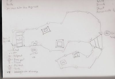
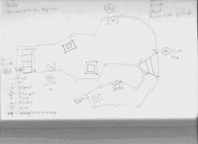
2. Create at least three gameplay mechanics for your level. How do these
objectives relate to your original story idea?
Answer 2: The 4 gameplay mechanics that my game has are walk, run, shoot and knife and these are so the character can get around the level.
3. Come up with five level objectives that correspond to your gameplay
mechanics. How will you identify these objectives in your level blueprint?
Answer 3: 1 Get your gun, 2 Hit switch 1, 3 Hit switch 2, 4 Sneak past bridge, 5 Get into the helicopter. These will be identifies by an obj within a circle.
Week 2
an original game idea. Discuss the central theme of your idea, and the methods you used
to bring your idea into existence.
Answer 1: My concept for my game is going to be based around stealth and the way the idea came into existence is because it is one of my favourite genres.
2. Create a backstory, environment, and three character descriptions associated with your
original game idea. How are these elements integrated and linked through a central
theme?
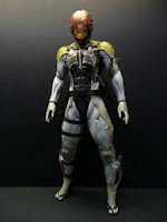
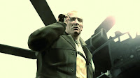
Answer 2: My backstory is that you are a military soldier that has infiltrated a major enemy facility that is located on an island in the middle of nowhere and you have been captured and will have to escape using any means possible. The environment is set around a forest with lots of metal and wooden structures used to hold the guards and mission objectives as well as a river that goes half way through the level that the player will have to cross somehow. The 3 characters that I will be creating will be a military soldier that currently has no name, a guard that will be posted into many places that is just your normal guard with his usual features and finally a guard captain that is in charge of your capture with upgraded equipment and one you should avoid at all costs
3. Document your concept with reference material and original sketches. How did you
capture your reference images? Create thumbnails and silhouettes. Compile these images
into an art “bible” to help guide your vision.
Answer 3:
.JPG)


Wednesday, August 4, 2010
Week 1
Question 1:
Imagine that you are a level designer working in the 1980s. Knowing the
limitations associated with this era, what type of game would you develop?
Answer 1: 3rd person shooter
Question 2: Play three games—one from the 1980s, one from the 1990s, and one released after 2004. Compare and contrast how levels and environments are designed in all three games.
Answer 2: The 3 games I played were Metal Slug for 1980's, Legend of zelda for 1990's and Call of Duty 4 for after 2004 and I found that environments were changed from one screen of play to a whole world to explore while the movement wasn't up to scratch through to highly detailed levels.
Question 3:
How does a game’s genre affect the way its levels and environments are
designed? Choose one level from three different games—each from a distinct
primary genre—and compare how these levels are designed with regard to
setting, goals, puzzles, and risk–reward system.
Answer 3: The 3 genre's I choose were Racing, Shooting, RTS(Real Time Strategy). The racing level is designed around a track were detail is in the vehicle and the track that is raced upon aswell as the weather; goals are milestone to achieve through skill level up and rewards and normally additions of or for a vehicle. The Shooting genre is designed around a specific time period and detail is paid towards the weapons, characters and actual level design; goals are checkpoints and missions that must be completed before progressing with rewards being titles ranks and upgrades. The RTS level has focus on the character and level design but more towards the characters then the level unlike shooting; goals involve objectives that can be completed or skipped it is the choice of the user with the rewards of the non compulsory strengthening your characters for easier use for later objectives.


